Saturday, October 31, 2009

a not-really-balance balance!

A sense of balance is in every human’s instinct. In other words, lack of balance disturbs us. Often when the word “balance” is mentioned, people relate the term to a symmetric lever where like shapes are place in the same position on both sides. We call that kind of balance a “bilateral symmetry”. However, feeling is more casual than this kind of balance. Therefore, another kind of balance comes to our mind! Asymmetric balance is when two dissimilar objects provide an equal visual emphasis. Balance is not always has to be in the middle. This informal balance is more complicated yet more expressive. Portraits often show this kind of balance in order to express feelings.


For instance, instead of just standing straight in the middle of the frame balancing every parts of body, these fashion models express their feelings through their actions. The portrait does not represent any symmetric balance; everything is not in the middle yet we can still feel the balance. A balance with feelings.

pictures taken from http://www.vandaimages.com

COLLAGE!?

Collage is a kind of art, which is very approachable for ordinary people. It encourages everybody to give a try on design. It is when people create a design by stick pieces of materials together. This kind of art is very convenient and sensible. People can simply turn trash into treasure! It is also very flexible in the forms it takes. Collage can vary from papers, bottles, buttons or clothes. For example, this quilt is made from a bunch of used jeans. Instead of just throwing them away, the artist cut jeans into different parts, rearranges them, then stick them together, and end up with a quilt!


This quilt below is also made of jeans. From these two quilts, we can see another advantage of collage. Designers can adjust composition easily and freely. It is an excellent way to improve designing skills for beginners and the materials are wisely reused!


pictures taken from The African American Quilts Exhibition, Nelson Art Gallery, UCDavis

another view on RHYTHM !

“Rhythm”

What is the first thing that comes in mind after you see this word? Something related to music?

We often relate rhythm to music. However, today I will introduce another type of rhythm – a visual rhythm.

Visual rhythm is one of our visual sensations. It is due to movement of our eyes, which moves along a repetitive design patterns. Not only music terms like legato or staccato but rhythm is also a characteristic of nature too. For example, ocean tides are repetition of the ocean’s movement every single day. The quilts below are some solid examples of this phenomenon of visual rhythm.

Like the ocean tides, this quilt shows a repetition of the same element in a regular order. It consists of black and white bowed-shape pattern in a certain rhythmic arrangement, which results in an impressive quilt.

Pattern can occur in both individual tiles and the larger units. Like this quilt below, it is actually made of a bunch of circular shape cloth. Then the artist simply expands the circular pattern into a rectangular quilt!

Artists can also expand their imagination by combining other experiences or senses to their work of pattern. This process is called “kinesthetic empathy”. This abstract quilt is made after the death of Annie Ruth Collins. The artist expresses the complexion of human’s feelings for certain situation through this quilt.

Pattern and rhythm are closely tied and they play a crucial role in the world of design. Designers are capable to play with visual presentation through the variety of patterns and rhythms.

pictures taken from The African American Quilts exhibition at Nelson art gallery, UCDavis

Monday, October 26, 2009

balance counts!


Not just some random clusters of food but intentionally adjusted is how the pictures are made at the Mittongtare Studio. Pornchai Mittongtare, the owner of the studio, is a food photographer. He emphasized on composition, balance, lighting and unity of each image so that it conveys the meaning effectively. He brings the message from food to the viewer. Each picture has its own dynamics, consists of both unity and variety. Even a mushroom can look so emotional. Or a group of fork seems to be dancing lively in the picture as we give it a glance. Without any use of commercial words, Pornchai serves his clients from various food companies successfully. He can make the food or even the fork look so delicious!

Some people might think that this is a pure aesthetic. However, art has always been a mean of visual communication. After all, composition and balance bring each picture to the best definition it can be. As we can see from Pornchai’s work, the objects in the picture are well organized, in a way that the viewer will see its true beauty. Unbelievably, balance and unity play such an important role in each visual presentation.


credit: http://www.mittongtarestudio.com/

is that possible?!

Some people originate ideas within themselves, while some does not. There are numbers of designers who are inspired by the materials they have been given. Design process might roughly be summarized as a process of thinking, looking and doing. However, some designers just simply start his process by doing it! They just happen to play and have lots of fun with the materials. For example, Tom Friedman is one of the designers who is significantly known for his remarkable designs which, most of them are made of simple household materials. He finds his way through stuff like toothpaste, soap, chewing gums, or even sugar cubes and end up with very impressive products. He even builds his own portrait out of sugar cubes! Tom evaluate ordinary to the art, which in some ways, is very useful design thinking method. We would not want our society to be packed with amazing designs that harm our environment. How nice would it be to have a society full of beauty that sustains!


toothpick creation!


foiled rock star!


cards creation!

black paper open cube !?


credits for picture:

https://secure.fangamer.com/forum/Fan/Forum/16659

http://smilingirisheyes.umwblogs.org/artists-that-inspire-me/

http://www.markmcleod.org/Mark_Mcleod/Art_Press/2006_12_01_archive.html

http://eyelevel.si.edu/2007/06/sculpture-as-an.html

Sunday, October 25, 2009

perception

What did you just see? A sphere, right? Have you ever wondered why you see a sphere when all the image shows is cones and triangles?


How about this figure? Actually, it is just 4 blue circles with one side missing arrange in a certain way but we tend to see a white square instead!


And if I ask what you just see, you will probably tell me you saw a smiley face. Aren’t that just circles assembling in a way that we perceive as a smiley face? And again, our brain perceive differently from reality.

All of these happen because of the Gestalt Theory. It states that human brain tends to group object together. We want to see things as a whole. Our brain prefers unity rather than detail in each visual presentation. Even when those lines and shapes did not show the figure directly, our brain is capable of drawing those connecting lines by itself. This may be one of the reasons why people can perceive things differently. We all have got a diverse in visual ability. Variety of perception depends on each person’s experiences in life. They combine it with what their brain perceive and create unique visual solutions. On the other hand, this phenomenon allows artists and designers to participate in the audience’s perception. They have wider field to play with their ideas and ways to present it just like this poster from School of Visual Art. If you look at it closely, all you will see is tons of words. However, if you just swiftly walk passes it, you would only see a picture of an eye.

Isn’t that amazing?


Pictures taken from:

http://hayleyjones.wordpress.com/2009/03/03/gestalt-research/

http://neurophilosophy.wordpress.com/2006/10/24/the-timing-of-the-shrew/

http://www.dday.com/blog/tag/gestalt/

Wednesday, October 14, 2009

window shopping


Occasionally as you walk through shopping arena, you might witness some thrilling displays on certain shop’s windows. But that only happens occasionally! Since the golden age of Display-1950s to 1960s ended, the display has been observed dead. Because the arrival of graphic designs was so new and notable, visual excitement ended in early 1970s. Display designers found themselves losing respect in their job. As the graphic designs conquer the market, displays and window scenes are similar all over different places. Decorative and mannequins were replaced by graphics. Each shop loses its identity without even recognizing it. Shoppers would not be able to distinguish between shops as they walk through.

However, displays have been saved and revived. One of the promoters of this resurrection is Harry Bader, creative director for the Banana Republic store on the Fifth Avenue. The reason why this action is being held is because the company changes its focus from product to brand. They want to build the love of the brand in consumer’s heart. As a result, unique display techniques, sophisticated styling and combination of art and music cooperate to create a new experience for consumers. Inspirations mostly come from interior design, art and theatre. Displays act as brand billboards.

As for now, displays are back and its best is yet to come !


pictures and information taken from:
"Store Presentation and Design No.2, Branding the Store", Martin M. Pegler, 2007

Tuesday, October 13, 2009

splendid toilets !


Toilet is a place we go everyday without doubts. We use it daily. It is an essential place for one’s life! Some designers realized that fact and decided to make their routine life more colorful. They come up with various amusing toilets!


First, is the public restroom called “WC 1”. It is located in the center of a metropolis city of London. It consists of nineteen spacious cubicles and a communal area with sofas, scented products and salon kits. Along with soothing music, users can enjoy utilizing this public restroom, isolating themselves from the busy town. The restroom is designed to fit women’s needs and is decorated specially for women as it is so girlie; white and a touch of pink. This is one of the most luxurious yet public toilets.


Follow by Buddy Holly, this toilet is located in the music theatre. The theatre was created with an intention to convey the greatness of the creation back in 1950s. With this in mind, the designers keep the theme and apply it to the toilet design. Men’s restrooms are resembles of dramatic stage where outlines of men are being crafted and the light will automatically switch on when someone enters the urinal area. This way the users get the feeling of theatre even when they are using toilets!


Lastly, this cute toilet is designed by Meike van Schijndel, a Dutch illustrator-designer. The idea is to blush user’s cheek every time they use the loo. The designer’s imagination is very distinct. She uses the color and form to represent her idea wisely. After all, this creation turns out to be an impressive toilet.

Toilet is something you use in your routine life. Wouldn’t it be nice if you make it to be a significant and inspiring thing so that every time you use it, your imagination soars to wherever it wants to.

pictures and information taken from:

"Restroom, Contemporary Design", Jennifer Hudson, 2008

"Flush! Modern Toilet Design", Ingridwenz-Gahler, 2005

shopping bags !?

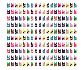
Susan Bijl's New Shopping Bag


production of shopping bags


bag from an umbrella shop in Japan


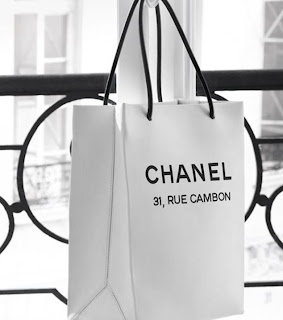
Chanel's shopping bag


The astonishing pictures above are something we call shopping bags!

It looks like they are a lot more than that, right?


Nowadays, shopping bags become one of the essential elements provided by the stores. Most shopping bags are printed using the photogravure process. It is made out of thin, strengthened paper and printed by a rotary press. Some are handmade. Shopping bags are very well designed because they represent the brand’s identity. They give the advertising benefits to the shops. Since the shopping bags are like a moving billboard, shops invest in designing and manufacturing it more. They vary in style, color and form, depending on the theme set by each shop. People used to wrap their presents but now they prefer to put them in a brand shopping bag more. Additionally, people can be proud whenever they hold those distinct bags because they are identified as the first-class shoppers who shop at luxury shops.

Moreover, shopping bags are beneficial in other ways too. They serve as an advertising agent. Nevertheless, they are designed to be reuse as much as possible to both represent the brand and save the nature since most of them are made of paper and are easy to decompose.

From many reasons pointed out, shopping bags are now becoming like one of the products from a store. They are beautifully made with an impressive style and as they act as an advertising agent, I believe that in a short time, we will witness a lot of inspiring shopping bags in our society.


information and umbrella bag picture taken from:

Shopping Bag Design in Japan, Hideo Saitoh, 1988

pictures from: http://style-files.com/2006/11/28/susan-bijls-new-shopping-bag/

http://www.chanel4u.com/chanel-shopping-bag-c-2.html

Monday, October 12, 2009

inspirations beyond oneself


As for tomorrow, you will not see me anymore”

– Dior


Sometimes, people find inspiration from within themselves while others do not. At times, flowers, shades, a bird’s songs, or the sound of a continuous oceanic wave can be good inspiration. Dior, one of the greatest fashion designers of all times, finds that his surroundings inspire him effectively. He would find himself surrounded by multifold of samples from his suppliers, letting his imagination plays with those fascinating fabrics delivered from a variety of places. Andre Levasseur, one of Dior’s closest collaborators, once stated that Dior would isolated himself in a room after his stay in the south of France before the birth of new collection can be witnessed. Moreover, Dior cares about the models too. He would carefully consider every choices of material until the best is chosen. This is a good example of how designers find inspiration outside themselves.

In reality, everything is limited. Constraints will always be there, in whatever you do. However, if you perceive things differently, limitation is challenging. Inspiration can be conceived from other sources than oneself. For instance, Dior was somehow bounded with the limitation of samples and time expected by the suppliers. Nevertheless, he took advantages of that by using whatever he was provided at its best. Amazingly, it often turns out excellent and we all witness it with our eyes. This can be say that even constraints can be inspirations too, if one wants to.


Inspiration is everywhere. You just need to find them.


Quoted from:

Christian Dior, The early years 1947-1957 by Esmeralda de Rethy and Jean-Louise Perreau, 2001

Pictures from:

V&A images - http://www.vandaimages.com/index.asp


Sunday, October 11, 2009

ordinary made extraordinary


TCDC is an abbreviation for Thailand Creative and Design Center. There, lies an extraordinary market, the Supermarket of Ideas.

“HmMm..whats that?” – I bet this question is conquering your mind! Am I right?

Creative Thailand is a project supported by the Thai government. Their motto is to build Thai economy by financially supporting creativity. They give opportunities for everyone to show their creativity and inspiration and give support in order to make those products practical and usable. As a result, the Supermarket of Ideas is now exhibiting.

This exhibition builds on 3 concepts:

1. Inspiration – why ?

2. Practical process – how ?

3. Attraction – wow !

Each product must represent all three mentioned. Everyone is more than welcome to join the project, both producers and consumers. They have their actual products for sale. This way, the producers earn some profit and new producers are being introduced into the market.

One of the booths that I find very attractive is “The Unusual B” This booth shows simple yet interesting notebooks. Irene Doang, the designer, is a second year student at the Faculty of Architecture, Division of Industrial Design, King Mongkut’s Institute of Technology Ladkrabang. This brand is based on her personal interest. It started when she made her mother a special box full of Biblical verses as a Mother’s Day gift. It was then that she wanted to show this beautiful creation to the public. She uses simple patterns like polka dots and stripes to make her notebooks. The brand name is derived from her name, Bebe. “The Unusual B” encourages its consumers to be unique and unexpected whenever and wherever they go. Be Unusual with “Unusual B” !

However, what I find most impressive is how the booth is decorated. It complements the brand’s motto perfectly. She uses simple things such as pillows, headbands, scarves, bracelets, combs and even candies to decorate her booth. Although she uses ordinary objects, it turns out to be extraordinary! She also sets the lighting so that the booth looks warm, cozy and inviting. The designer shows her ability to combine her design and daily products effortlessly. She transforms such simple items into a notable space. She knows how to deal with the condition of limited space wisely.

Last but not least, the ruler notebook is the one I like the most. It looks impressive, on the other hand, very practical. She made it possible for the users to use inspiring products in a convenient way; one of the core ideas of industrial design!

For more information visit : http://www.tcdc.or.th/ploy-saeng/
http://www.tcdc.or.th/events

Check out "The Unusual B", please contact : Irene Doang
http://bebe912.multiply.com
amiry912@hotmail.com

Friday, October 9, 2009

approachable typography ?


Located near the center of UC Davis, the Design Museum is now exhibiting the typographic exploration in Hangul, an exhibition of work by Hyunju Lee and Phil Choo. Many simple but meaningful works are shown. The designers dig into the linguistic history of each letter to connect the pronunciation, meaning, and appearance; they are able to express this through their works. Each piece of art seems to be very emotional, yet very warm and understandable. The deep relationship between the sound and appearance of each letter has been clarified with a big attempt of the designers. They make it visible by using color and theme as a medium so that it is approachable for everyone to understand.


One of the two typographic that I like the most is the one called “Ileona”, by Phil Choo. “Ileona” is a Korean word for “stand up”. This visual interpretation is inspired by the song “Ileona” which goes “stand up, stand up, like spring sprouts…” The lyric encourages listeners to endure whatever difficulties they are facing and the designer emphasizes the word “stand up” by literally making the image stand up. Very impressive, of course.


Secondly, Its Hyunju Lee’s “Hangawui”. This print is adapted from the Korean folk dance called “Ganggangsuwolrae” which is No.8 on the list of Korean’s intangible cultural assets. She represents the dancing movement through the hangul typographic perfectly. The character itself seems to be dancing with joy! It also represents the Korean culture. Hyunju combines the Korean tradition with her design to denote the impressive Korean society to the world in an accessible way.

Overall, this exhibition is a very amusing one. The clean, relaxed structure of the place gives the visitors calm and peaceful sensation. Rather than spending time in a busy and complicated city, why not give this exhibition a try and relieve your mind and creativity ?

Check out the opening time at www.designmuseum.ucdavis.edu